
บทที่ 2: แผนภูมิควบคุมค่าเฉลี่ยและพิสัย (Xbar & Range Control Charts)
In lesson 1 we discovered why we need control charts. Now we are going to learn how to draw the control charts.
We use different types of control charts for different types of data. Data can be divided into two major categories, variables and attributes.
ในบทที่ 1 เราค้นพบว่าทำไมเราต้องมีแผนภูมิควบคุม ตอนนี้เรากำลังเรียนรู้การสร้างแผนภูมิควบคุม
Variable data is any measurement which has a continuous scale. For example:
ข้อมูลวัด(Variable data) คือทุกๆการวัดใช้มาตรวัดแบบต่อเนื่อง (continuous scale) ตัวอย่างเช่น :
length, weight, temperature and pressure.
ความยาว, น้ำหนัก, อุณหภูมิ และความดัน
Attribute data is based on discrete counts. For example:
ข้อมูลคุณลักษณะ(Attribute Data) คือค่าที่มีพื้นฐานจากการนับ ตัวอย่างเช่น จำนวนตำหนิบนพื้นผิว, จำนวนผลิตภัณฑ์ที่บกพร่องและจำนวนใบแจ้งหนี้ที่ยังไม่ได้ชำระ
the number of blemishes on a surface, the number of faulty products and the number of unpaid invoices.
With variable data we can measure to any accuracy that we want, for example 12.5, 3.075 etc. Attribute data, on the other hand, can only have whole number values like 1, 3, 12 etc.
ด้วยข้อมูลวัดเราสามารถวัดความแม่นยำที่เราต้องการได้เช่น 12.5, 3.075 เป็นต้น ในทางกลับกันข้อมูลคุณลักษณะสามารถมีได้เฉพาะค่าจำนวนเต็มเช่น 1, 3, 12 เป็นต้น
In this lesson we are going to look at a process where we have been given a preferred target value for a variable measurement. Our job is to try to get results as close as possible to that target.
ในบทนี้เราจะมาดูกระบวนการที่มีค่าเป้าหมายสำหรับการข้อมูลวัด งานของเราคือพยายามทำให้ได้ผลลัพธ์ที่ใกล้ค่าเป้าหมายมากที่สุดเท่าที่จะเป็นได้
The process is a tennis ball launcher and we are trying to shoot balls at a target distance. The target is 500 and the specifications are 300 to 700. The location of the previous shots fired are given in the screen.
กระบวนการนี้คือเครื่องยิงลูกเทนนิสและเรากำลังพยายามยิงลูกให้อยู่ในระยะเป้าหมาย เป้าหมายคือ 500 และสเปคคือ 300 ถึง 700 ตำแหน่งของการยิงก่อนหน้านี้จะแสดงไว้ในดังภาพหน้าจอ
Imagine that you are the operator of a machine – the launcher. Your job is to fire balls at the target and get them to land as close as possible to the ideal value of 500. First we need to ‘center’ the process.
ลองนึกภาพว่าคุณเป็นพนักงานดูแลเครื่องจักร – เครื่องยิงลูกเทนนิส งานของคุณคือยิงลูกบอลให้ตรงเป้าหมายและให้มันใกล้ที่สุดเท่าที่จะเป็นไปได้ที่ค่าในอุดมคติคือ 500 อันดับแรกเราต้องการ “ค่าตรงกลาง” ของกระบวนการ
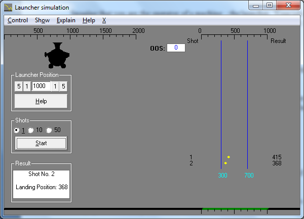
When we fire one ball from the launcher we find the value is 415.
เมื่อเรายิงลูกบอลลูกแรกจากเครื่องยิงเราได้ค่าเท่ากับ 415
The customer of this process wants the landing position to be 500, so what do we do now? Should we compensate for the error by moving the launcher?
ลูกค้าของกระบวนการนี้ต้องการให้มันตกที่ตำแหน่ง 500 ดังนั้นการยิงของคุณเป็นอย่างไรตอนนี้? เราควรชดเชยค่าความคลาดเคลื่อนโดยการปรับย้ายเครื่องยิงหรือไม่?
The answer is NO because we don’t know the process yet. There is always a certain amount of variation in every process and if we only have common cause variation and we are trying to adjust for this variation we will actually cause more variation on the output.
คำตอบคือ ไม่ เพราะว่าเรายังไม่รู้กระบวนการเลย มีความผันแปรจำนวนหนึ่งเสมอในทุกกระบวนการและหากความผันแปรที่เรามีเป็นพียงความผันแปรปกติทั่วไปและหากเรากำลังพยายามปรับความผันแปรนี้เราจะเป็นสาเหตุของความผันแปรที่ผลลัพธ์มากขึ้น
Look at the display of Landing positions at the right of the launcher. Each landing position is different and the variation may be due to common causes which are always present in this process.
ดูภาพที่แสดงตำแหน่งตกที่ด้านขวาของเครื่องยิง แต่ละครั้งตำแหน่งตกแตกต่างกันและความผันแปรน่าจะเกิดจากความผันแปรปกติที่แสดงให้เห็นตลอดในกระบวนการนี้
We now have more information to get an idea how the process is performing. We can calculate the average of the shots which is 413 (Rounded).
ตอนนี้เรามีข้อมูลมากขึ้นให้เกิดไอเดียว่าจะจัดการอย่างไรกับกระบวนการ เราสามารถคำนวณหาค่าเฉลี่ยของการยิงซึ่งได้ค่า 413 (ปัดเศษ)
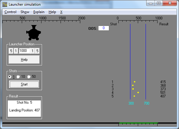
If we fire 45 more shots we will get a better estimate of the real average of the process. After 50 shots the process average is 419 (Rounded)
ถ้าเรายิงเพิ่มอีก 45 ครั้งเราจะได้ค่าประมาณที่ได้ค่าเฉลี่ยที่แท้จริงของกระบวนการ หลังจากยิง 50 ครั้ง กระบวนการนี้มีค่าเฉลี่ยอยู่ที่ 419 (ปัดเศษ)
We can now move the launcher so future shots will center around 500. Assuming that nothing changes in this process, future output should now be centered on 500.
ตอนนี้เราสามารถย้ายเครื่องยิงดังนั้นการยิงในอนาคตจะอยู่รอบๆค่า 500 สมมติว่าไม่มีการเปลี่ยนแปลงอะไรในใหม่กระบวนการนี้ อนาคตผลลัพธ์ควรมีศูนย์กลางอยู่ที่ 500
“Assuming that nothing changes” is a big assumption. At this stage we do not know very much about our process and we do not know if things are likely to change over time. So, we need to find out if the process is “statistically stable”. We fire off another 100 shots then we will create a control chart.
“สมมติว่าไม่มีการเปลี่ยนแปลง” เป็นสมมติฐานที่ยิ่งใหญ่ ในขั้นตอนนี้เราไม่รู้เกี่ยวกับกระบวนการเลยและเราไม่รู้ว่าสิ่งต่างๆมีแนวโน้มที่จะเปลี่ยนแปลงตลอดเวลาหรือไม่ ดังนั้นเราต้องหาให้เจอกระบวนการที่ “เสถียรในทางสถิติ” เรายิงออกไป 100 ครั้งจากนั้นเราจะสร้างแผนภูมิควบคุม
The landing position is a continuous scale. We are actually using complete numbers for the results (423, 657 etc.) but there is nothing to stop us using more accurate measurements if we wanted to (423.45, 657.09 etc.)
ตำแหน่งตกเป็นสเกลแบบต่อเนื่อง เรากำลังใช้ผลลัพธ์แบบจำนวนเต็ม (423, 657 เป็นต้น) แต่ก็เป็นไปได้ในการใช้ค่าวัดที่ละเอียดกว่าถ้าต้องการ (423.45, 657.09 เป็นต้น)
This type of data is called variable data. We will use an Xbar and Range chart as the control chart for this process. In an Xbar and Range chart, the data is arranged into subgroups.
ข้อมูลประเภทนี้เรียกว่า ข้อมูลวัด (Variable Data) เราจะใช้แผนภูมิ Xbar และ Range เป็นแผนภูมิสำหรับกระบวนการนี้ ในแผนภูมิ Xbar และ Range ข้อมูลถูกจัดเรียงในกลุ่มย่อย (Subgroup)
Let’s take a quick look at the data table.
เรามาดูอย่างเร็วๆกันที่ตารางข้อมูล
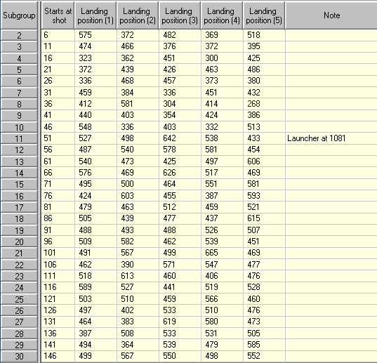
Notice that there are 5 columns with “Landing position ( )” at the top. The number in brackets means that the column is part of a subgroup. For each row of the table, the data in these five columns represents one subgroup. Look at subgroup 25.
สังเกตว่ามี 5 คอลัมน์ที่มีชื่อว่า “Landing position ()” ที่หัวคอลัมน์ ตัวเลขในวงเล็บหมายความว่าคอลัมน์เป็นส่วนหนึ่งของกลุ่มย่อย สำหรับแต่ละแถวของตารางข้อมูลในห้าคอลัมน์นี้แสดงถึงกลุ่มย่อยหนึ่งกลุ่ม ดูที่กลุ่มย่อย 25
Look at the row with the number 25 in the grey column at the left. This subgroup starts at shot number 121. The subgroup columns contain the results of shots 121, 122, 123, 124 and 125.
ดูแถวที่มีหมายเลข 25 ในคอลัมน์สีเทาทางซ้าย กลุ่มย่อยนี้เริ่มต้นที่การยิงครั้งที่ 121 คอลัมน์กลุ่มย่อยประกอบด้วยผลลัพธ์ของช็อต 121, 122, 123, 124 และ 125
Now let’s look at the control chart of this data:
ตอนนี้เรามาดูที่แผนภูมิควบคุมของข้อมูลนี้:
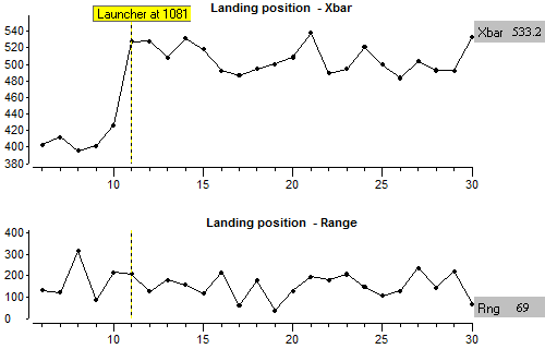
An Xbar and range chart contains two graphs. For each row in the data table, the subgroup average is plotted (Xbar) along with the largest value in the subgroup minus the smallest value (Range). Let’s confirm this:
แผนภูมิ Xbar และ Range ประกอบด้วยสองกราฟ แต่ถ้าแถวของข้อมูลในตาราง ค่าเฉลี่ยของกลุ่มย่อยถูกพล็อต (Xbar) ไปพร้อมๆกับค่าสูงสุดลบค่าตำสุดในกลุ่มย่อย (Range)
เรามายืนยันกัน:
The last subgroup is highlighted and on the right side we see that Xbar = 533.2 and the Range = 69.
กลุ่มย่อยสุดท้ายที่ไฮไลท์ไว้และเราจะเห็นทางด้านขวาว่าค่า Xbar = 533.2 และค่า Range = 69
The 5 measurements of subgroup 30 are 499,567,550,498 and 552.
ค่าวัดทั้ง 5 จากกลุ่มย่อยที่ 30 คือ 499,567,550,498 และ 552
We can confirm that the value on the Range chart 168 is the highest value (567) – the smallest value (498) and the average is the sum of values/5.
The point at which the launcher was moved is shown on the chart. This is the equivalent of a written note on a paper chart and this is the sort of information an operator should record on a control chart.
เราสามารถยืนยันได้ว่าค่าบนแผนภูมิ Range คือ 168 มาจากค่าสูงสุด (567) ลบค่าต่ำสุด (498) และค่าเฉลี่ยคือผลรวมของค่าทั้งหมดหารด้วย 5
จุดที่ผู้ยิงได้ยิงออกไปได้แสดงบนแผนภูมิ สิ่งนี้เทียบเท่ากับการเขียนโน๊ตลงบนกระดาษและสิ่งนี้เรียงตามลำดับข้อมูลที่คนงานบันทึกลงบนแผนภูมิ
Next we will calculate the control limits and draw control lines on the chart. The purpose of these lines is to show when we should suspect that something has changed which affects the process (in other words, a special cause of variation has occurred).
ต่อไปเราจะคำนวณเส้นควบคุมและเขียนเส้นควบคุมลงบนแผนภูมิ วัตถุประสงค์ของเส้นเหล่านี้คือให้แสดงเมื่อเราสงสัยว่ามีบางสิ่งบางอย่างเปลี่ยนแปลงที่กระทบกับกระบวนการ (หรือพูดอีกอย่าง, ความผันแปรพิเศษ(Special Cause) ได้เกิดขึ้นแล้ว)
We calculate the control limits from a section of the data. Of course we know that the launcher has been moved and moving the launcher is a special cause of variation, so we should calculate the limits with results which come after the launcher move. For now, we will not worry about how the calculations are made.
เราคำนวณเส้นควบคุมจากบางส่วนของข้อมูล แน่นอนเรารู้ว่าผู้ยิงได้ยิงและปรับเปลี่ยนเครื่องเป็นความผันแปรพิเศษ ดังนั้นเราควรคำนวณเส้นควบคุมจากผลลัพธ์ที่ได้หลังจากผู้ยิงปรับเปลี่ยนแล้ว ตอนนี้เราจะไม่กังวลเกี่ยวกับการคำนวณที่ได้สร้างแล้ว
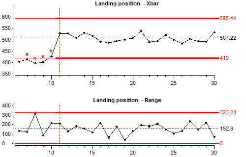
All the results after moving the launcher are within the control limits, so the process is probably stable or “in statistical control”. This means that all the variation comes from common causes. Common cause variation is just the normal random variation which is inherent in the process.
ผลลัพธ์ทั้งหมดหลังการปรับเปลี่ยนของผู้ยิงอยู่ภายในเส้นควบคุม ดังนั้นกระบวนการน่าจะเสถึยรหรือ “เสถียรทางสถิติ” สิ่งนี้หมายความว่าความผันแปรทั้งหมดมาจากความผันแปรปกติที่เป็นเพียงแค่ความผันแปรแบบสุ่มที่เป็นธรรมชาติในกระบวนการ
If we want to be in full control of a process we must use the charts to identify when special cause variation occurs, determine if things were better before or after the change, then make one of these situations permanent.
หากเราต้องการควบคุมกระบวนการอย่างสมบูรณ์เราต้องใช้แผนภูมิเพื่อระบุเมื่อเกิดความผันแปรพิเศษ พิจารณาว่าสิ่งต่างๆดีขึ้นก่อนหรือหลังการเปลี่ยนแปลงจากนั้นกำหนดให้สถานการณ์ใดสถานการณ์หนึ่งเป็นแบบถาวร
Let’s carry on producing. We fire off another 100 shots.
เรามาเริ่มยิงลูกบอลกัน เรายิงลูกบอลออกไปอีก 100 ครั้ง

Look at the control chart. All we need to know now is whether there has been any change in the process since the lines were calculated. Is the output stable?
Look to see if any of the points are outside the control limits. It looks as if something unusual happened around subgroup 40 (launcher shot 200). Subgroup average drops below the control line so a special cause of variation has occurred. As an operator, your job is to produce results as close as possible to 500 but the average landing position has suddenly changed.
You could, of course re-centre the process (move the launcher). This might help in the short term, but you have no idea whether things might suddenly change back to normal. The only really satisfactory solution is to carry out an investigation, find the source of the special cause of variation, learn from what happened, then make sure that this kind of change does not occur again.
A word now about specification or tolerance limits. In most industrial processes, the operator is given specification or tolerance limits as well as the target value. However, these specification limits should always be looked on as representing the MINIMUM acceptable quality from the process. World class quality does not come from treating everything within the specification limits as equally acceptable. We must try to produce as close as we can to the target value. This is what the customer really wants.
In our bouncing ball process, an unknown special cause of variation made the subgroup average fall at around subgroup 40 (shot 200). It might be that the individual results are still within the specified tolerance limits, but our customer would prefer the results to be 500. So we must make efforts to produce with the average output at 500 and the minimum variation that our process is capable of. So we must investigate and remove special causes of variation even if we are still producing within the specification or tolerance limits.
When we did the investigations we found out that one batch of balls has slightly less bounce than normal. We discard this batch and demand from our supplier that they supply us with statistically stable product (they can only be sure of doing this by using control charts).
We have removed this special cause of variation so things should return to normal from shot 256. We fire off another 50 shots.
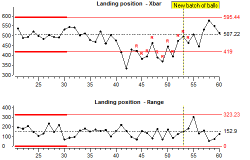
The control chart should show clearly that a change occurred around subgroup 40 and things returned to normal around subgroup 53.
Now we will look at how the control limits were calculated.
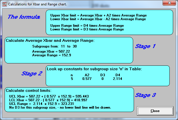
The mathematics are not difficult. You need to find the average Xbar (average subgroup average) and the average range for the section of the data that you use to calculate the limits. You also need to look up a table to find constants called “A2” “D3” and “D4” for the subgroup size that you are using.
By distinguishing between special cause variation and common cause variation, control charts can help operators and managers to run processes which produce on-target with minimum variation.
If special cause variation is present, we must find the root cause and stop this from occurring again in the future. We ask the questions:
“What happened at approximately that point to change the results?”. and
“How can we prevent this from happening again?”
If no special causes are present and we want to get better results, we ask different questions:
“Looking at all the results, is the average off-target?” and
“Looking at all the results, why is there so much variation?”
To reduce common cause variation we might need better machinery, more frequent maintenance or less common cause variation within raw materials.
Lesson 2 summary:
- When we are given a target or ideal value for something, we should always try to get results with the Average on target and with the minimum amount of variation. We should not just try to get results within the specification limits.
- Control charts can help to distinguish between common cause variation and special cause variation.
- A good type of control chart for variables is the Xbar and Range chart. Xbar and Range charts use data arranged into small subgroups.
- It is not enough just to react to special causes of variation by adjusting the process to compensate. World class quality comes from removing the special causes of variation and preventing them from returning. Because this often requires management action, SPC will only work properly when managers understand the role they have to play in creating stability and reducing variation.
End of Lesson 2 Statistical Process Control