
Lesson 4: Power of control charts to detect instability
In lesson 2, we used a section of data to calculate control limits for a process. In that example, the process was stable in the early stages and we used data from that period to calculate the control limits.
In this lesson we are going to investigate what happens if the process is unstable while producing the data which is used to calculate control limits. We ran a simulation of a process which is unstable in the early stages.

You now see that the process is indicating instability even though the data used to calculate the control limits contains instability.
This ability of Shewhart control charts to detect special causes of variation, even when these special causes are present in the data used to calculate the control limits, is very important. Most industrial processes are not naturally in a state of statistical control.
The control limits are set at 3 times sigma from the average. Sigma is similar to standard deviation. This sigma is calculated based on the average range of the subgroups (range is the maximum value minus the minimum value) or in other words based on the within subgroup variation.
The reason that the Xbar chart detects special variation is because the control limits are calculated using an estimate of standard deviation based on the average subgroup range. Since the subgroups are taken from consecutive products, this means that all the variation between subgroups is filtered out.
When using control charts it is important to ensure that subgroups contain mostly common cause variation. Normally this can be done by measuring a small number of consecutive products for each subgroup, and having a time gap between the subgroups.
X or Individual Value chart:
Sometimes it is not possible to take consecutive measurements from a process which can be grouped in a subgroup. For example, there is no variation if we take consecutive measurements eg temperature or the pH value of a bath. In this case, we will have to use an X & mr (individual value and moving range) chart.
In this type of chart we plot the individual measurements on one graph and the differences between the consecutive measurements on the other graph, this is called the Moving Range (sometimes only the individual points are shown, the moving range chart is omitted).
Here is an example to show how moving ranges are calculated.
| Measurement | 2.5 | 3.1 | 3.3 | 2.4 | 2.9 | 2.3 | 2.4 | |
| Moving range | 0.6 | 0.2 | 0.9 | 0.5 | 0.6 | 0.1 |
If we run a process with is unstable in the early stages and we chart the individual values we see the control chart below. We see that the chart is able to detect both disturbances in the average as well as disturbances in the range.
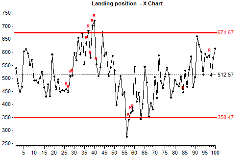
The chart shows some instability, both by having some points outside the control limits and because there are long runs in the data. A run is where a number of consecutive results are all above average or all below average.
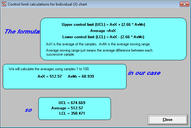
Lets look at how control limits for individual value chart are calculated:
During an implementation we will also implement control charts where removing instability is not the highest priority because it is not the most critical characteristic. In that case we may use different ways to calculate limits. This advanced subject is outside the scope of this training.
Lesson 4 summary:
- Shewhart control charts will indicate instability even if instability is present in the data used to calculate the control limits.
- We must use our knowledge of the process when deciding how to sample results and arrange them into subgroups. We should do this in a way which we know will reduce the chances of special cause variation occurring within subgroups.
- If we do not know much about the process or we cannot be confident that little special cause variation will be present within subgroups, then we should use an X (individual values) chart or and X & mr (moving range) chart. With these charts, the control limits are based on the average difference between each individual result.
- If we want to detect if the process is stable it is a mistake to calculate the control limits from the deviation of the individual results from the Average. The distance of the control limits from Average is calculated from a short-term dispersion statistic (subgroup range or moving range).
End of Lesson 4