
Lesson 5: Binomial control charts
In lesson 2 we looked at Xbar and Range control charts. In lesson 4 the X (individual value) chart was introduced. In both these cases, we used variable or measurement data. This is data which comes from a continuous scale.
There is a different type of data called “attribute” data. Attribute data comes from discrete counts. For example:
– the number of blemishes on a surface,
– the number of faulty products,
– the number of unpaid invoices.
With attribute type data, in order to choose the correct type of control chart, we have to look at the way the data was generated. If we know in advance that the set of data will exhibit the characteristics of Binomial data or Poisson data then these types of charts should be used.
Binomial data:
Binomial data is where individual items are inspected and each item either possesses the attribute in question or it does not. Binomial means “two names” so if each item can be put down as either a pass or a fail then we can consider the data gathered to be Binomial data.
For example, consider the attribute ‘blue’ in samples of beads scooped from a box which contains beads of many colours. Each bead scooped is either blue or it is not blue – so if we create a stream of samples taken from the box and we count the number of blue beads in the samples, then we can assume that the resulting data will be Binomial type data.
Other examples of counts which would generate binomial data are:
– Late deliveries,
– Non-conforming goods,
– Out of specification components.
The random variation of Binomial data acts in a particular way, because of this we can calculate where to put the control limits. All we need to know is the average of the data set and the sample size.
We can generate Binomial data using the simulation of scooping beads from the box – so let’s do this now. The bead box has 20% red products (bad) and 80% white products (good):
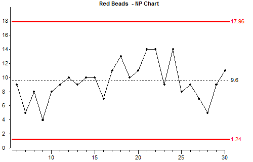
This type of chart is called an “np” chart. It is used when we know we have Binomial data and the sample size does not change. The points on the np chart are simply the number of items in the sample which have the attribute being counted (in this case we are counting beads with the attribute “red”)
Let’s look briefly at how the control limits were calculated:
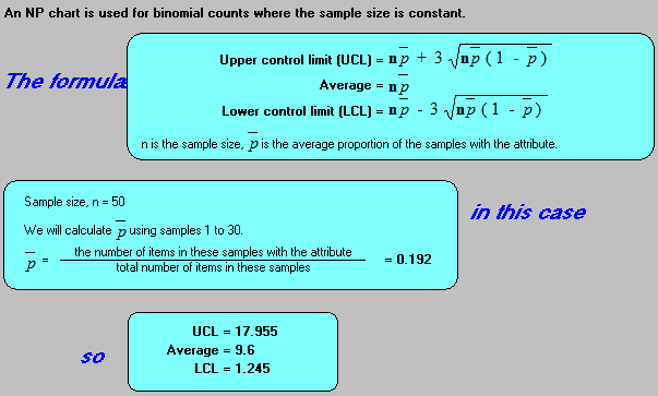
In these formulae “n” is the sample size (in this case 50, the size of the paddle), and “p bar” is the average proportion of the samples which have the attribute being counted.
Binomial data with different sample sizes:
If we have binomial data but the sample size is not constant, then we cannot use a np chart. We will now use the simulation to add new samples to the data we have already started, but we will change the sample size:

When the sample size is not constant for every scoop we have to convert counts to a rate or proportion. The resulting chart is called a “p” chart. We convert to a rate by dividing the attribute count by the sample size.
You will notice that there is a step in the control limit lines at the point where the sample size changed. Before we look at the mathematics of the control limits, let’s try to understand why there is a step.
The purpose of the control limits is to show the maximum and minimum values that we can put down to random common cause variation. Any points outside the limits indicate that something else has probably occurred to cause the result to be further from the average.
As we have said before, the random common cause variation of Binomial data acts in a particular way. The variation with large sample sizes is smaller than the variation with small sample sizes. We can use the simulation to demonstrate this.
We will change the subgroupsize to 5 and take 30 more subgroups:
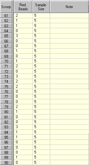
Look at the results in the Data Table and keep in mind that the proportion of red beads in the box has not changed. In this exercise there are always 20% red beads in a box.
When the sample size is 5, a lot of times the number of red beads scooped is 1 (20% of the sample size), but it is not unusual to get 0 or occasionally 3 (60% of the sample size). In rare cases like in this simulation we can even have 4 and we have a false alarm.
Now let’s use a very big sample size:
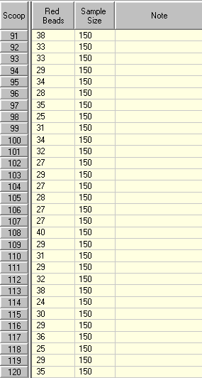
Look again at the results in the Data Table. Remember that 20% of the beads in the box are red and 20% of the average of the sample size is now 30.
As you would expect most of the results are near 30, but even the most extreme results are nowhere near 0% or 60% of the sample size (60% of the sample size would be 90).
Now let’s see how the control chart handles these extreme sample sizes.
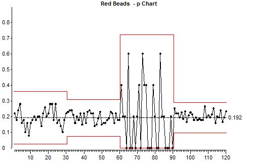
Look at the way the points which correspond to the small sample size (samples 60 – 90) vary up and down, then compare this with the variation with the large sample size (after 90). Keep in mind that we are not looking at absolute numbers here, we are looking the proportion of the sample which is red.
Look at the position of the control limits for the small subgroupsize and the large subgroupsize.
This illustrates one of the basic points about using control charts for attributes. Small subgroupsizes produce control charts which are not sensitive because there is so much random common cause variation in small sample sizes. Large sample sizes produce more sensitive control charts.
What this means is that if a process has a special cause of variation acting on it from time to time, it may not produce any points outside the control limits if the sample size is small. The same special cause of variation is more likely to produce points outside the control limits if we use a large sample size.
Let’s have a quick look at the mathematics for the control limits:
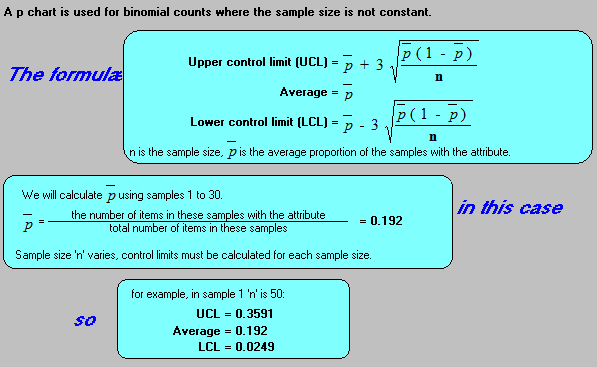
Notice that the limits have to be separately calculated for each subgroupsize. The example given is for sample number 1 (subgroups 1 to 30).
Criteria for binomial data:
We can only use an np chart or a p chart if we know in advance that the data produced will be binomial data. The full conditions which have to be satisfied before we can consider a set of data to be Binomial are:
- The count must arise from a known number of discrete products (goods or services).
- Each product inspected must either have, or not have, the attribute which we are counting.
- The products inspected must not influence each another. If one item has the attribute, this fact must not change the likelihood of its neighbours having the attribute.
Lesson 5 summary:
- Data from process can be divided into two major categories, variables and attributes.
- Binomial data is attribute data where individual items are inspected and each item either possesses the attribute in question or it does not.
- An “np” chart is used for Binomial data if the sample size is constant.
- A “p” chart is used for Binomial data if the sample size is not constant.
- Before using an “np” chart or a “p” chart we have to make sure that all the conditions for Binomial data are met.
- With applying SPC to attribute counts, small sample sizes make it difficult to distinguish between common cause variation and special cause variation.
End of Lesson 5