
Lesson 6: Poisson and “X” control charts using attribute data
In lesson 5 we created control charts for Binomial data. Binomial data is where we look at products or services, and for each, decide it as a “pass” or a “fail”. It is not always best to classify a whole product in this “all or nothing” way. For example, we might want to count the number of blemishes on a surface. We will never know the number of ‘non-blemishes’ on the surface so the data gathered is not Binomial data.
Criteria for Poisson data:
We can consider data to be Poisson type data if:
- Discrete counts of an attribute can be made. e.g. tears in material, cracks on surfaces etc.
- The counts arise from a known area of opportunity.
- As with Binomial data, the attributes must arise independently of one another. In other words, there must be no mechanism which makes the attribute normally occur in clusters.
- There are relatively few incidents of the attribute appearing compared with what might happen in the worst possible circumstances.
Another way of looking at this is that Binomial counts represent DEFECTIVES whereas Poisson counts represents DEFECTS.
With Poisson data, we use a “c” chart if the sample size is constant, and a “u” chart if it is not constant. With Poisson type data, the sample size is sometimes called the “area of opportunity”.
Let’s look at a file with Poisson type data:
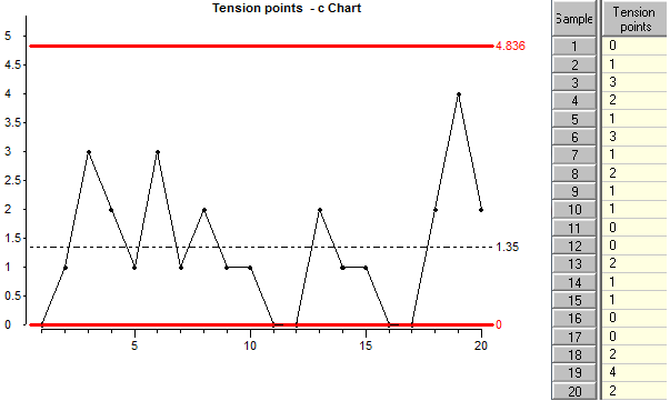
A “c” chart is very similar to an “np” chart, the points plotted are simply the numbers in the data column. The only difference is the way the control limits are calculated: Look at how the limits are calculated:
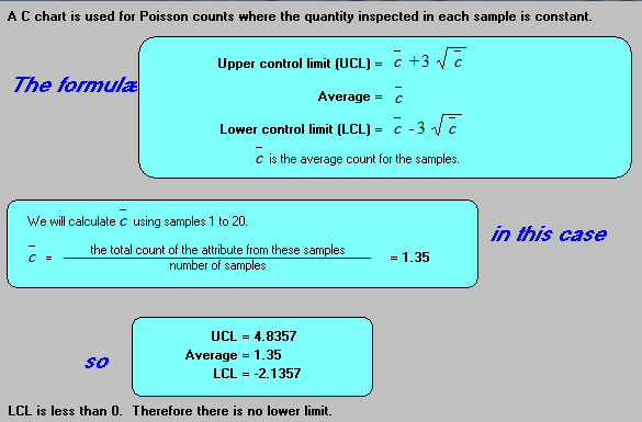
The control limits for a “c” chart are calculated from the average attribute count for all the samples. Notice that the sample size is not used anywhere in these calculations.
Poisson data with different “areas of opportunity”:
Now let’s look at a chart for Poisson type data where the sample size or area of opportunity is not constant.
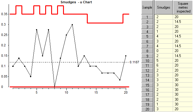
Because the “area of opportunity” is not the same for all samples, we need to convert each attribute count into a rate before plotting the points on the chart. The resulting chart is called a “u” chart. The rate is simply the attribute count divided by the sample size or area of opportunity for the sample.
Look at how the limits are calculated:
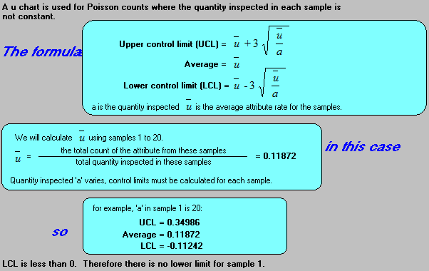
Notice that the control limits are tighter for larger areas of opportunity. This is for the same reasons that the control limits vary for different sample sizes in “p” charts.
The X (individual value) control chart with attribute data:
In a lot of cases the Binomial or Poisson charts are not appropriate because one of the conditions is not applicable. In that case we can use an X or ‘individual’ chart. Control limits for X charts are empirical limits based on the variation in the data and these are almost always valid.
Let’s compare a binomial chart with an X chart using the same data. First we will generate some data and we will create a Binomial chart and an X (individual values) chart from same data.
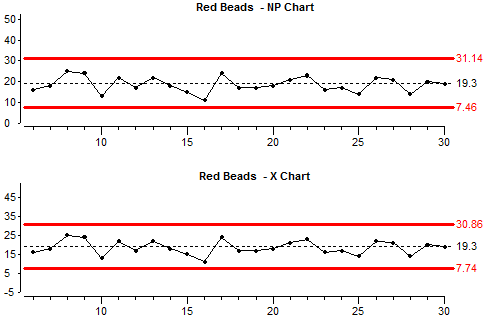
Look at the upper control limit (UCL) and lower control limits (LCL) for each chart.
If we cannot be confident that the data we have fulfills the conditions to be binomial or Poisson data, then we can usually rely on an X chart to do a pretty good job. However there are limitations:
Let’s take more subgroups but now with a subgroupsize of 20. We now have a non constant sample size.
Sometimes X charts should be rate charts when the sample size is not constant and sometimes they should not – it depends on what the measurement represents. In our case the number of red beads scooped is definitely dependent on the sample size so we should look at an X chart based on rates.
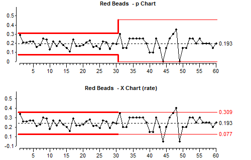
The p chart and the X rate chart are both showing proportions and the control limits have been calculated using scoops 1 – 30. Compare the two charts. Look at the data and the control limits before and after the change of sample size (the change was at subgroup number 30).
Because we have not changed the number of beads in the box, we are looking at the results of a stable process so in theory control charts should not show any points outside the control limits.
There is always more random common cause variation with small sample sizes and you can see that the points on both charts jump up and down more after we change to a smaller sample size.
Because the control limits on a binomial chart are based on a theoretical knowledge of the way binomial data behave, the control limits change to accommodate the different sample sizes.
On X charts, the control limits are based on the variation between successive points in the data stream. When this variation changes due to altering the sample size, this can be misinterpreted as a process change.
X charts with low average:
When the average count is very small, another problem prevents us from using X charts. With attribute counts, the data can only take integer values such as 6, 12, 8 etc. Values such as 1.45 cannot occur. The discreteness of the values is not a problem when the average is large, but when the average is small (less than 1) then the only values which are likely to appear are 0, 1, 2 and occasionally 3.
The whole idea of control charts is that we want to gain insight into the physical variations which are happening in a process by looking at the variation of some measurement at the output of the process. When the measurements are constrained to a few discrete values then the results are not likely to reflect subtle physical changes within the process. For this reason X charts should not be used for attribute counts when the average count is low.
Lesson 9 gives more information about using attribute control charts when the average count is low.
Lesson 6 summary:
- Poisson data is where we are counting defects (whereas binomial data is where we count “defectives”)
- With Poisson data, we use a “c” chart if the sample size is constant.
- With Poisson data, we use a “u” chart if the sample size is not constant.
- With Poisson type data, the sample size is sometimes called the “area of opportunity”.
- Before using an “c” chart or a “u” chart we have to make sure that all the conditions for Poisson data are met.
- If we cannot be sure that the data will meet all the conditions to be Binomial or Poisson data, then we may be able to use an X chart, but the average count must be greater than 1.
End of Lesson 6