
ยทที่ 3: ฮีสโตแกรม(Histograms) และการแจกแจง(Distributions)
A histogram is a way of showing a set of measurements as a picture.
ฮีสโตแกรมเป็นแนวทางหนึ่งของการแสดงถึงชุดของค่าวัดในรูปแบบของภาพ
Let’s fire some balls from the tennis ball simulation and then look at a histogram of the landing positions.
เรามายิงลูกบอลจากการจำลองเครื่องยิงลูกเทนนิสและจากนั้นดูที่ฮีสโตแกรมของตำแหน่งลูกบอลตก
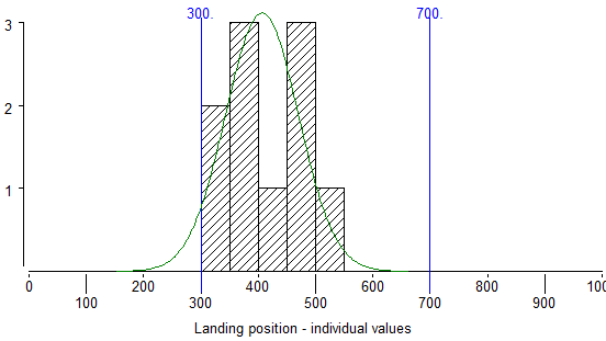
In this histogram, the measurements are the landing positions of the balls from the launcher simulation. The possible landing positions are set out on the horizontal scale and this is divided into a number of sections. For each section, a column is drawn and the height of the column represents the number of balls which have fallen within that section of landing positions. For example the column between “300” and “350” on the horizontal scale is 2 units high, this means that 2 balls have landed between 300 and 350.
Let’s check that the histogram has been drawn correctly for our data.
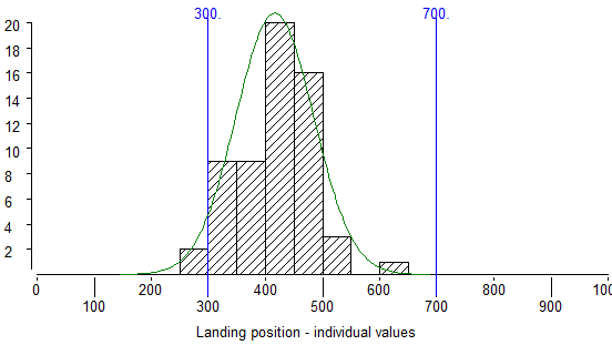
Now we will fire more balls and look at the histogram contain more results.
This is how the histogram looks after 60 shots.
Lets put a bit more results in the histogram.
Here you see the histogram after 510 shots
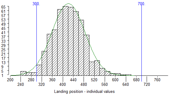
It should become clear after we have fired this many shots that the highest columns are near the middle of the histogram. This means that most of the balls land near the middle of the range of possible results.
The shape of the histogram is call the “distribution“. It shows how the measurements are “distributed” among the range of possible measurements.
A particular bell-shaped histogram pattern is known as the ‘normal’ distribution. It occurs frequently in nature and is common in industrial processes. We know a great deal about normal distributions and this helps us to make some general statements about the outcome of processes.
We will now produce a normal distribution starting with a new set of shots:
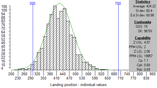
Notice that the histogram shape looks like a bell with a high middle and tails at each end.
This box shows some figures for the data which is used to make the histogram. We are going to describe the first two figures under the “Statistics” section.
Average:
The Average is calculated in the normal way from the individual results: The individual results are added up then divided by the number of results.
Standard Deviation:
‘St dev’ means Standard Deviation. Standard Deviation gives us a figure for how much the individual values in a set of measurements are spread around the Average. A set of measurements where most of the values are near the Average has a low Standard Deviation, a set of measurements where most of the values are far away from the Average has a high Standard Deviation.
You can create and use control charts without knowing how to calculate Standard Deviation. For those who want to know, here is how to calculate a Standard Deviation:
First, find the Average of all the values
For every individual value, find the distance from the Average.
Square this number (multiply it by itself).
Add all the squares together
Divide by the number of measurements minus one.
Find the square root of this number.
I repeat that you do not have to remember how to calculate Standard Deviation to draw control charts or to use the charts to improve processes. All you need to know is that Standard Deviation is a measurement of spread.
For Normal distributions, we can use Standard Deviation to make some useful statements about a set of measurements. We can also make some predictions about future measurements from the same process if it is reasonable to assume that the process will not change (it will only be reasonable to make this assumption if the process is stable).
If past measurements show a normal distribution, and the process is stable, then we can say:
As long as the process stays stable:
– About 68% of results will lie between one Standard Deviation below Average and one Standard Deviation above Average,
– About 27% will lie between one Standard Deviation and two Standard Deviations from the Average,
– About 4.5% will lie between two Standard Deviations and three Standard Deviations from the Average,
– Only a very small proportion (about 0.3%) will be more than three Standard Deviations from the Average.
Let’s see if this is true by checking one of these statements
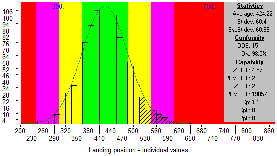
– The green zone is up to 1 Standard Deviation either side of the Average.
– The yellow zone is more than 1 but less than 2 Standard Deviations from Average.
– The purple zone is more than 2 but less than 3 Standard Deviations from Average.
– The red zone is more than 3 Standard Deviations from Average.
The blue lines show the specification limits for the launcher simulation. In the “Conformity” section of the information box you will see figures for the number of results which are out of specification (OOS) and the percentage of the results which are within specification. If we drag the specifications to put them at the border of yellow and purple the percentage OK is recalculated.
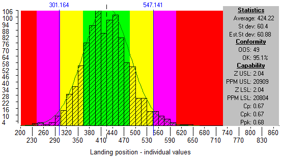
The percentage OK figure now shows how many of the results are within 2 Standard Deviations from Average. You see it is 95.1 % which is close to what we were expecting from the information above.
So, we now know that for a normal distribution, the majority of results will be less than one Standard Deviation from Average. However, we also know that there will be a small number of results more than 3 times Standard Deviation from Average. We cannot tell WHEN these extreme results will happen, but we know that they will happen sometime.
Using statistics to predict the future:
These percentages tell us approximately what has happened in the past. but often we are asked what sort of results we will get in the future from a process.
We can predict that the process will continue to produce roughly the same proportion of results in the 1, 2 and 3 standard deviation zones IF THE PROCESS DOES NOT CHANGE IN ANY WAY.
Also, the percentages given above for the normal distribution are only true over the very long term. It would be wrong to suggest that we can tell with confidence what the measurements will be in any one particular batch of goods.
Lesson 3 summary:
- A histogram is a way of showing a set of measurements as a picture.
- The shape of the histogram is know as the distribution.
- Standard Deviation gives a figure for how much spread there is in a set of measurements.
- If past measurements show a “normal” distribution, and the process is stable, then as long as the process remains stable, we can predict the approximate number of results which will be at different distances from the Average.
End of Lesson 3