
Lesson 7: Pareto chart
A Pareto chart helps us to identify priorities for tackling problems. The Pareto principle (named after a 19th century Italian economist) states that 80% of defects or problems usually arise from about 20% of the causes.
Let’s look at data from an imaginary process.
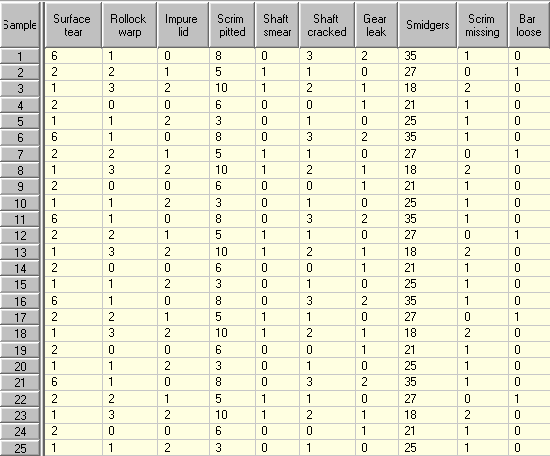
The columns in the table represent 10 types of non-conformity or imperfection which can occur in Assembly M412. Each of the 25 rows contains the results of one inspection. Let’s look at this data using a Pareto chart:
In a Pareto chart, the categories of data are shown as columns and the height of each column represents the total from all the samples.
The order of the columns is arranged so that the largest is shown on the left, the second largest next and so on. Since these counts usually represent defects or non-conformities, the biggest problems are therefore the categories on the left of the chart.
Our Pareto chart makes it immediately obvious that the most frequent problem is Smidgers appearing on the assembly.
It is common practice on Pareto charts to superimpose a cumulative percentage curve. At each point on this curve you can see the percentage of the overall number of non-conformities or imperfections which are caused by the categories to the left of the point. This is best illustrated by example. We have added a red line for the second defect Scrim pitted. By eye, follow the red lines from the column to the % scale on the right.
The red line points to just under 80%. This means the first two columns account for nearly 80% of all the non-conformities or imperfections that occur in Assembly M412. If we concentrate our efforts on reducing the number of smidgers and pitted scrims, then even if we are only partially successful, we are likely to make a substantial difference to the number of assembles which we have to send for rework.
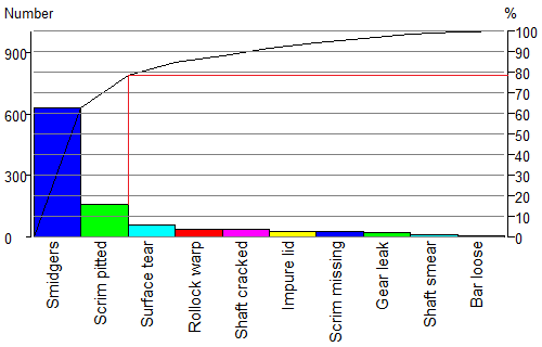
Of course, all types of problems do not have an equal impact in terms of cost or importance. So if we know the cost of putting right each type of problem, then it is better to draw the Pareto chart with the column heights representing the total cost.
A “unit cost” value has been entered for each column. We are now looking at the total cost associated with each column (total number multiplied by unit cost). You will see that the left vertical scale is now labeled “$ US”.
When the chart is showing costs, we get a different picture from the picture we get when it is showing numbers Although smidgers are the most common imperfection in assembly M412, they are easy to remove – a quick wipe with a cloth is all that is needed. A pitted scrim, on the other hand, needs the assembly to be dismantled. A leaking gear housing is the big nightmare – but fortunately they are not very common.
We see that pitted scrims account for about 60% of all rework costs, so this is the problem which is creating the highest cost to the company.
Although we do not get many gear leaks, they are actually the second biggest problem in terms of costs. Smidgers do not cost the company a lot of money despite the fact that they occur in large numbers.
So looking at Pareto chart for M412 costs, we should concentrate our efforts in eliminating pitted scrims and gear leaks.
Although a Pareto clearly identifies the major cause of problems you also have to consider the amount of efforts required to solve a problem. It might be that an issue is very easy to fix, so make sure you always briefly review all issues before you start to solve the most important problems.
Pareto are used in a lot of different situations and can be adapted to get the right information. Let’s look at a Pareto of downtimes:

This Pareto is shown with the bars horizontally. With downtime analysis the total downtime is important but more information is required. In this Pareto we see that a label is added with the total downtime in minutes but also the number of downtimes is given. One long downtime might require a different approach than a large number of short downtimes. In this Pareto the color of the bar indicates a downtime category.
Lesson 7 summary:
- A Pareto chart helps us to determine priorities.
- If the cost associated with one unit of each column is known then we can choose between displaying total numbers or total costs for each category.
- The columns on the left or rows on top have the highest totals.
End of Lesson 7