
Lesson 8: Scatter chart
When we want to reduce or eliminate a problem, we will need to come up with ideas or theories about what is causing the problem. One way to check if a theory should be taken seriously is to use a scatter chart, also called regression analysis.
To use a scatter chart, we first have to take a series of measurements of two things over a period of time. The two things that we would measure are the problem itself, and the thing that we think may be causing the problem. We then plot the measurements on a scatter chart. The scatter chart will help us to see whether there is a mathematical relationship between two sets of measurements.
We will look at how to use a scatter chart using an example:
Flaking plugs:
A company makes large cylindrical casings known as “plugs” for a chemical process.
Analysis using a Pareto chart showed that the problem of surface flaking of the plugs was costing the company a lot of money.
A process improvement team was set up to try to reduce the number of “flakers”. The team quickly found that everyone had a different opinion of what was OK and what was a flaker. The first job, therefore, was to come up with a good definition of a flaker which everyone could use. The process operators were shown how to use control charts and they started keeping a chart of the number of flakers produced in each batch. This chart showed that the process was unstable. so they knew that they had to look for special causes of variation. Mary, one of the process operators on the team, said she always feels cold on days that they have a lot of flakers.
The process operators started keeping records of the air temperature at the time the plugs were made. At one of the team meetings Jack pointed out that on at least two occasions when the number of flakers was outside the control limits, it was raining.
The team asked the lab for help to test the theory that rain was a factor. One of the engineers pointed out that it was actually raining that very day but there were very few flakers. Nevertheless he still suggested that it might be a good idea to measure the moisture content of the main ingredient.
First, let’s have a look at the control chart. Because each plug is either a flaker or it is not a flaker, the chart we should use is a binomial chart.
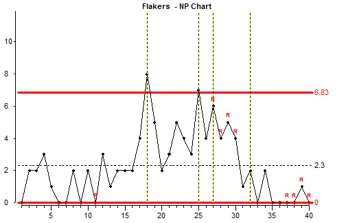
The data is out of control because some points are outside the control limits. There are also runs of 10 consecutive points above and below the average line – these also indicates instability. Now let’s look at a scatter chart.
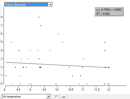
On this chart, the number of flakers is on the vertical axis and the air temperature is on the horizontal axis. For each row in the data table, a dot is put where the two values meet.
In a scatter chart, if the measurements on the horizontal axis are not related in any way to the measurements on the vertical axis, then the dots will appear at random, with no pattern visible. If there is a mathematical relationship between them then the dots will tend to group into a fuzzy line or curve.
In this case there does not seem to be any pattern to the points on the scatter chart. We can conclude, therefore, that there is no correlation between air temperature and the number of flakers produced. This means that we can say that the air temperature is not a factor in producing flakers. Now let’s have a look if humidity is of influence;
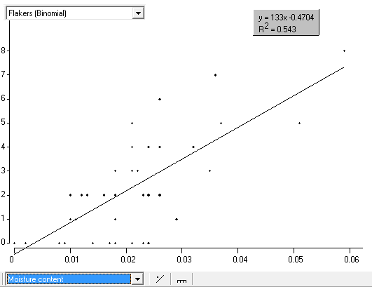
On this scatter chart we see flakers on the vertical axis and moisture content on horizontal axis. There appears to be a correlation between the two sets of numbers because we can see the dots have formed into a fuzzy line. This chart is showing that flakers increase when the moisture content increases. This still does not prove that one causes the other. There could be a third factor which causes BOTH to change at the same time. Still, we seem to have a clue here.
We have added a “best fit” line through the points. The equation for this line is shown at the top right of the chart. The R-squared figure is a measure of how well the data fits the line.
– If R squared = 1 then all the points lie on the line.
– If R-squared is 0 or near 0, then there is no correlation between the data on the two axes so the line and the equation has no relevance.
Now look again at the scatter of the temperature. You can now see the best fit line through these points. The R-squared value is low showing that there is no correlation between the two sets of data.
A few remarks are important when using scatter charts: When looking at scatter charts it might be important to include all other relevant information. It might be important to look simultaneously at control charts, scatter charts and data table to get a better understanding what is exactly going on. This analysis is beyond the scope of this training.
Another important aspect of a scatter analysis is that the results are strongly influenced by an outlier. If we look at the scatter chart with temperature and add an outlier (18 flakers with 35 degrees) we get the following result:
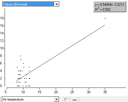
You see that one outlier is drastically changing the R-squared value. So always look at the chart and ask yourself what is happening exactly.
Lesson 8 summary:
- A scatter chart helps us to see whether there is a mathematical relationship (correlation) between two things which we have measured. This may help us to find the causes of problems.
- Even if we find a mathematical relationship this does not necessarily mean that one of them causes the other.
End of Lesson 8