
Lesson 9: Attribute control charts with low average
We are now going to look at a particular problem you can encounter with attribute control charts.
We will generate four streams of data from a process and create a special cause of variation in each data stream. Now we will look at control charts for all four colours of beads.
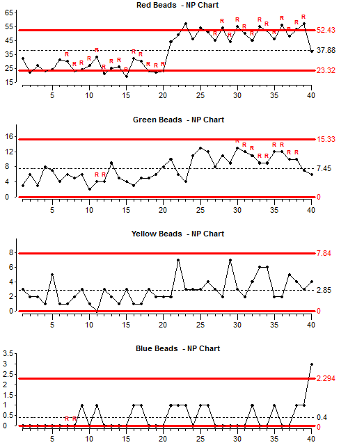
For all four colours, the number of beads in the box doubles after shot 20, therefore we would expect to see a clear signal that the special type of variation has occurred.
The control limits are calculated using all the data so scoops 1-20 should give results below average and scoops 21 – 40 should give results above average.
Look at the chart for red beads: The chart is showing points outside the control limits and there are long runs below and above average – so the special variation is clearly visible on this chart.
Now look at the charts for Green, Yellow and Blue beads: The special cause of variation is not so obvious on these charts, especially on the chart for blue beads.
Now we will look at the position of the upper control limit for each chart: Look at the average (Avg.) figure for the red beads chart. Look at the Upper control limit (UCL) figure for red beads chart. The upper control limit is probably about 1.4 times the average.
Look at the Average and Upper control limit values for the other three charts. Work out approximately how many times greater the UCL is than the Average.
As the average figure gets lower, the upper control limit gets further from the average. In the Blue bead chart, the Upper control limit is many times greater than the average.
The only thing that is different between the four charts is the average number of beads scooped. This demonstration shows one of the inherent problems with control charts for attributes. If the average of the samples is low, then attribute control chart are not sensitive at detecting special variation.
Because we usually count problems or failures, this means that as we get more successful at removing problems, the charts become less good at separating special cause variation from common cause variation.
The best way to overcome this problem is – whenever possible – use a measurement from a continuous scale and plot this on a chart for variables (Xbar & Range or X) rather than use count data with an attribute chart.
For example, you are trying to produce a product or service within a given specification of time, weight or length, then make control charts from the time, weight or length measurement. This will indicate special variation much better than an attribute chart showing the number of out-of-specification products.
If it is not possible to use a variable, then there are other possible solutions:
- Use large sample sizes to make the average count as high as possible.
- If you have already collected the data, you could combine a number of the original samples into a smaller number of large samples. This would increase the average count per sample, but there is a danger here. If many of the new large samples contained products from before and after process changes, then the special variation could be hidden. It would only be sensible to combine samples if the new larger samples still contain products made at approximately the same time.
- We could measure the interval between occurrences of the attribute and plot this on an X chart. The interval could be the number of products which do not have the attribute, or the total volume of good product between each occurrence of bad product. We could also measure time intervals (months, days or minutes) between occurrences of the thing we are interested in.
With extreme low defect percentages you can also use the Cumulative Count Control Chart which uses an exponential scale but this goes beyond the scope of this training.
Lesson 9 summary:
- Beware of any attribute control chart which has a very small average. Special causes of variation may be present in the process but not showing on the chart.
- Always try to use control charts with variable measurements rather than simple pass / fail counts.
- If it is not possible to use variable measurements, then, if you have enough data, you may try combining samples or calculating intervals to see if there is any indication of special variation.
End of Lesson 9